
In the process of creating a web design, the main focus is usually on a few key points. First of all, we think about the color scheme, fonts, placement of elements on the page, pictures, and schemes.
However, we often find ourselves in a situation when these tools are not enough for a completed and filled web page. In this case, you can try some non-obvious methods of web design and replace a solid color with an interesting texture.
Web textures are an effective and easy way to not overload the design and attract the user's attention at the same time. This technique adds volume and completeness to your webspace.
In this article, we will look at all aspects of the use of textures in web design, think about why they are important, and mention the basic rules of working with them.
Let’s start with the basics.
What are Web Textures?
In the world of web design, structures exist in the form of texture background images. These images look like a three-dimensional surface, the relief of which can be felt through the screen. They serve as a tactile sensation for the eyes. That's why web textures add depth to design and attract attention.
In addition, the similarity of the texture of the background images to the objects of the living world gives the virtual space a piece of reality. Along with this naturalness, there are associations with what is around, somewhere outside the screen.
Types of Textures Used in Web Design
Looking for texture background images, you can easily get lost in the huge number of stock images of different types. To explain the difference between them and make your choice easier, we will categorize web textures by two criteria: realism and prominence.
Realism is the level of similarity of the texture on the screen to the same texture in the real world. Accordingly, variability can begin with the usual color gradient, as we observe at sunset, and end with wood, dry leaves, and pebbles on the beach textures.
Prominence instead is about how much texture stands out among other elements of the composition. The variability of abstract texture background images by this criterion starts from a barely noticeable contrast and ends by screaming a striking difference and attracting a lot of attention.
I want to share some examples of how these criteria look and mix on texture background images you may find on the internet. We can define 4 main types based on the factors mentioned before.
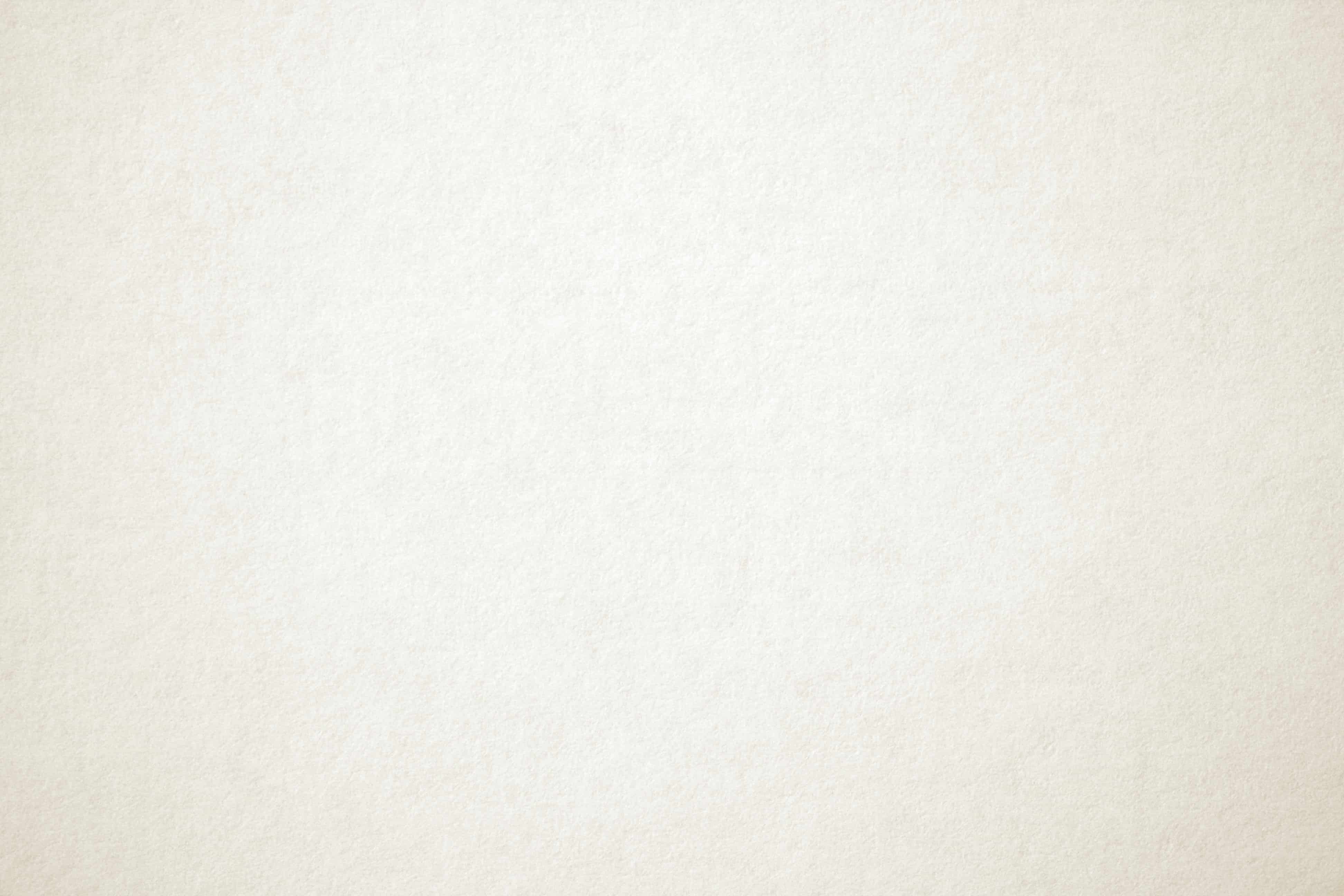
Slightly realistic backgrounds are one of the most popular choices for web design. Sometimes it's difficult to tell right away that it's a texture and not just a color. However, subconsciously users perceive it as something familiar from the world of real things, so we get the desired effect in the form of the right emotion.
Highly realistic texture background images are great for attracting attention and empowering the main theme of your website. However, it is very easy to make the design too heavy and turn the realistic textured background into some odd, unconnected with everything else, spot.

An example of a low-contrast abstract texture is a color gradient. As well as slightly realistic backgrounds, this type is very popular among web designers. It doesn’t distract the user’s attention from more important parts of the page and engages at the same time.

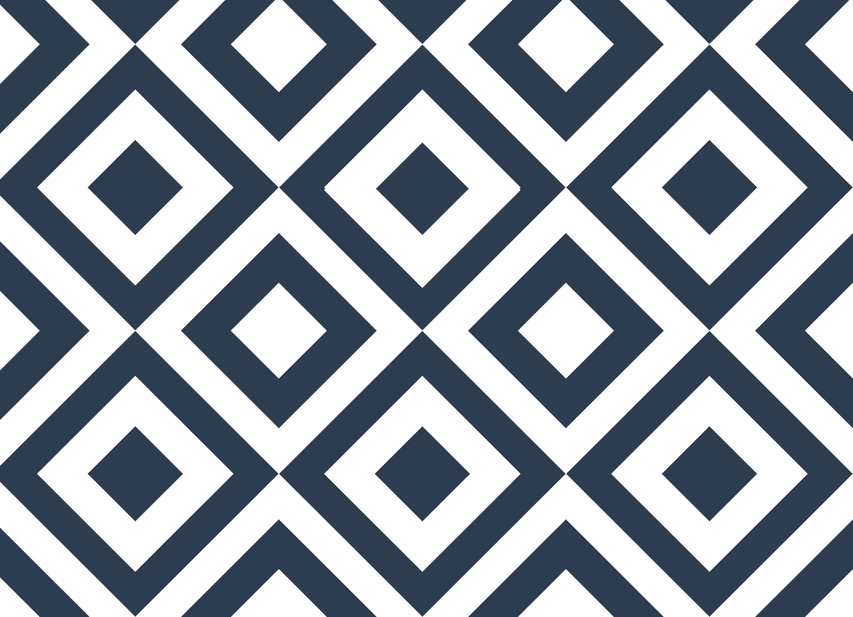
The last variant is abstract and highly contrasting texture background images. They are similar to very realistic textures with their attention-grabbing style. However, they provoke other emotions not related to something natural.

Web Textures vs. Patterns
Despite their similarities, textures and prints in the context of web design are slightly different. Prints consist of identical parts that can be repeated and expanded many times and the final result will be the same.
Although the textures may seem repetitive, they are a whole image in which it is difficult to find any repeats.

Why Do We Use Textures in Web Design?
The main task of any effective design or its element is to make the site interesting for the user. Textures in particular have the following functions:
Conjure Feelings
Earlier we mentioned the feature of the design to evoke emotions and influence how the page is perceived by the user. Textures do it covertly, unnoticed, but very effective.
For a potential customer to associate your brand with positive emotions, evoke these emotions in a person's subconscious with texture background images. A travel agency can safely add the texture of sand, sea, and rock. Coffee shops often use textures of ground coffee and milk foam. Determine what emotions and associations you want to evoke in the user and choose the image accordingly.
Guide the Eye
In addition to hidden emotions, textures can subconsciously direct our vision to an important part of the site. It is because of the contrast between the embossed surface of the textured image and the flat filling of the rest of the site. This works especially well with fonts.
Textures and the contrast they create is great for highlighting the structure of the page. You can easily define all the necessary parts and provide a better understanding of the content.
How to Use Texture in Web Design
Once you have learned how to choose texture background images based on your needs, you should use them correctly in your design. We recommend keeping in mind the following principles while working with textures:
1. Don't overdo it.
Texture background images should enhance the content of your page, not replace certain parts of it. Achieve a balance between attracting attention and distraction from the main info.
2. Keep text legible.
Textures can both emphasize fonts and make them unreadable. To avoid difficulties in reading the text, choose enough contrasting colors.
3. Match your intended feeling.
Always keep in mind the basic concept of your brand when creating a design. This principle also applies to the choice of texture background images. Feel what conveys what your brand is about in the best way and what evokes the right emotions.
4. Balance image quality with load time.
Keep in mind that high-quality textures can slow down page load times. You need to find the golden mean between fast-loading blurry images and the long wait for good quality.
Where to Find Free Web Design Textures
There are many resources for free texture background images to create the desired design. Here are some of them:
- Subtle Patterns
Here you can find over 500 textures and patterns for your designs. They are small in size, so there will be no load problems. This is a great choice if you are looking for texture background images png.
- CSS Gradient
We have already mentioned that gradients are the most popular type of texture. This free generator will provide you with an infinite number of original backgrounds.
- Textures.com
Choose from 100 categories of png texture background images. To find the right one try to write very specific search requests, like “texture background images yellow,” “texture background images black,” or “texture background images snow.” However, there is a limit to downloading 15 textures per day.
Conclusion
In the last few years, the primary trend in web design has been two-dimensionality and minimalism. We do not deny its relevance now, but there is a growing need to add some life to what we see on the screen, and textures successfully help do this.
When you know the main aspects of working with them, all you have to do is find the right picture and use it in your design.