
Test a website for different mobile devices. Use responsive design test tool.
We have launched a service which is helpful for checking the responsiveness of a website - Responsive Website Test. There is no matter if you use Wordpress, Joomla, some other CMS or even static HTML - you can check if your site is mobile friendly to allow your site visitors browse your site on different mobile devices with ease.
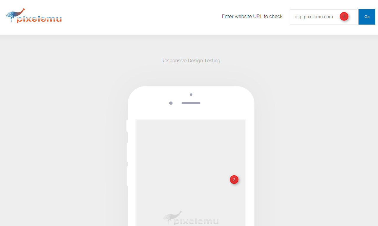
Test a website on different mobile devices
Should you test your website looks for mobile devices?
Now is the time when almost every person uses smartphone or tablet. There is no matter if we use it for business, entertainment or learning. In the last years, web traffic generated by mobile devices has grown drastically. The trend will be deepened in next years without no doubt. Statistics tell us that we even more often browse the internet using mobile devices.

Above picture tell us everything - mobile users are even more important than desktop users. The mobile friendly website is not an extra feature but essential part of a website. Doesn't matter if we have a simple blog, small company or large online shop - we have to care about mobile users because we make money thanks to them.
What is RWD?
RWD is a shortcut from Responsive Web Design. It's a package of techniques that developers use to make website mobile friendly.
If we are using a smartphone the website should accommodate to its resolution. The same if we use a tablet or other smartphone - the site should just look good. It doesn't matter if for on market is available new smartphone with a resolution that was not available before. RWD is a set of general rules so we should have no worries about it. For example, we have rules for devices with width below 480px, not for Samsung Galaxy S8 or iPhone 7.

How does mobile test work?
The mobile friendly test tool is, of course, an emulator, not a real device. It simulates various resolutions for popular mobile devices. It could be very helpful during web development.
Take a look on the list with emulated devices:
- Samsung Galaxy Tab 1, 2, 3
- Samsung S6, S7, S7 Edge, LG G3, G4, G5
- iPad 1, 2, 3, 4, mini, Air and Air2
- iPhone 5, 6, 6s and 7
- iPhone 6 Plus and 6s Plus
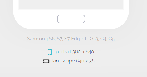
Below every device, there are links that switch orientation from landscape to portrait and from portrait to landscape. We can emulate in this way situation when someone browses website horizontally and vertically.
Responsive themes and plugins
All of our WordPress themes and plugins are 100% RWD ready. Detailed list:
- flexible layout grid ( Bootstrap 3 )
- resizable images
- themes and plugins will adapt to the screen depends on a resolution
- CSS3 Media Queries
- widgets can be visible or hidden depends on device resolution
- well touchscreen support
Basic RWD techniques
Flexible images
img {
 max-width: 100%;
 height: auto;
}
This code makes that images on a website will load in full size until a resolution is too small and images will be scaled by the browser.
Media queries
It's a technique introduced in CSS3. With media queries, we can apply styles only for desired width or height.
@media screen and (min-width: 767px) {
 .col-1 {
 width: 50%;
 float: left;
 }
 .col-2 {
 width: 50%;
 float: right;
 }
}
Above example apply styles for minimal width 767px.
@media screen and (min-width: 767px) and (max-width: 1200px) {
 .col-1 {
 width: 50%;
 float: left;
 }
 .col-2 {
 width: 50%;
 float: right;
 }
}
We can change min-width to max-width or even combine these values.
.desktop {
 display: block;
}

.mobile {
 display: none;
}

@media screen and (max-width: 767px) {
 .desktop {
 display: none;
 }
 .mobile {
 display: block;
 }
}
We can also show/hide elements on selected width of the screen.
Above CSS entries are just only simple examples how to use RWD. There are many techniques of using CSS and JS that help to build RWD website.