
How to use Bootstrap grid system with WordPress theme?
Our WordPress themes support bootstrap grid system and we give you the possibility to fully advantage of handy bootstrap grid classes that may be used for multiple devices.
At the first sight, the 12 columns grid system may look a little bit complicated but it's really simple and you will love it for sure!
Screen resolution ranges
At first let's check all available resolution ranges. The site should be flexible and responsive on each resolution level. It means that all site content should adapt to all devices. How to do it?
| devices | resolution |
|---|---|
| Extra small devices | Phones (<768px) |
| Small devices | Tablets (≥768px) |
| Medium devices | Desktops (≥992px) |
| Large devices | Desktops (≥1200px) |
Grid classes
The helpful solution are class prefixes that may used for widgets. Starting from desktops to phones you may configure how you want to display widgets of each theme layout row. But how to use classes of bootstrap in WordPress theme?
| devices | resolution | class prefix |
|---|---|---|
| Extra small devices | Phones (<768px) | .col-xs-* |
| Small devices | Tablets (≥768px) | .col-sm-* |
| Medium devices | Desktops (≥992px) | .col-md-* |
| Large devices | Desktops (≥1200px) | .col-lg-* |
Boostrap 12 columns idea
Bootstrap grid system allows to display 12 widgets in a row at the same widget position. Moreover, you may specify the number of widgets displayed in a row, which actually means that you may controll its width.
Let's take a look at the table of cells below.
We've got 12 yellow cells (widgets) in one row. Numbers inside cells are handy equivalents for percentage row division. By controlling the sum of numbers - that must always give 12, you may display many various schemes.
Equal cells widths
Various cells widths
How does it look in practice?
Simply the number inside cell replaces * from class prefix that has to be entered for the widget. Let's check where you should place the class.
Go to Appearance -> Widgets and open a widget. At the bottom of the widget configuration, you will find 2 fields that you may use for entering the class you want to use.
1. It's standard input to put any class for widget so it works for grid classes as well. Remember to separate classes with spaces.
2. It's the latest solution we introduced to our latest themes. Use it instead of the standard input above.
Optionally you may specify classes for mobile devices, otherwise widgets layout sheme will be controlled automatically in responsive way.
Let's see how it looks on the site.
Example 1 - 4 widgets displayed in a row
Let's calculate what number should be used to display 4 widgets in a row.
4 widgetes * X = 12 available cells
12/4 = 3
The result is 3 so we would use class col-md-3 for each widget to display 4 widgets in a row on desktops.
Optionally you may specify the class for mobile devices.
Example 2 - 2 widgets displayed in a row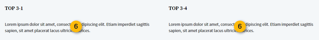
Let's calculate what number should be used to display 2 widgets in a row.
2 widgets * X = 12 available cells
12/2 = 6
The result is 3 so we would use class col-md-6 for each widget to display 2 widgets in a row on desktops.
Optionally you may specify the class for mobile devices.
Example 3 - 3 widgets in row, various widths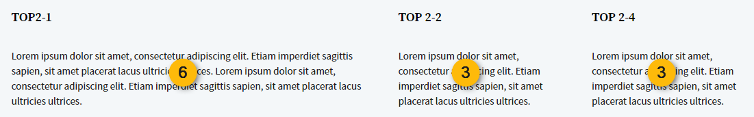
Let's calculate what number should be used for each widget.
The first widget we want to be 50% wide of the row, the rest 25% for both.
So we know from the example above that 50% is number 6.
12 cells - 6 (50% widget) = 6 (the rest of space for 2 widgets left)
6 (rest of space) / 2 widgets = 3 (which is 25% of the whole 12 cells)
Final check: 6 + 3 + 3 = 12
So for the first widget should be entered col-md-6 class and col-md-3 for next 2 widgets.
Summing Up
By using those simple calculations you may controll each widgets position of the theme. It means that the theme layout becomes very flexible and follows your needs since we understnad that the customer may want to modify the theme layout that is presented on the demo site. Hope you find the above tutorial clear and easy to understand. If any questions feel free to contact us and ask. We will be happy to help!
Like it? Please share :)